ADADAPTED DIRECT
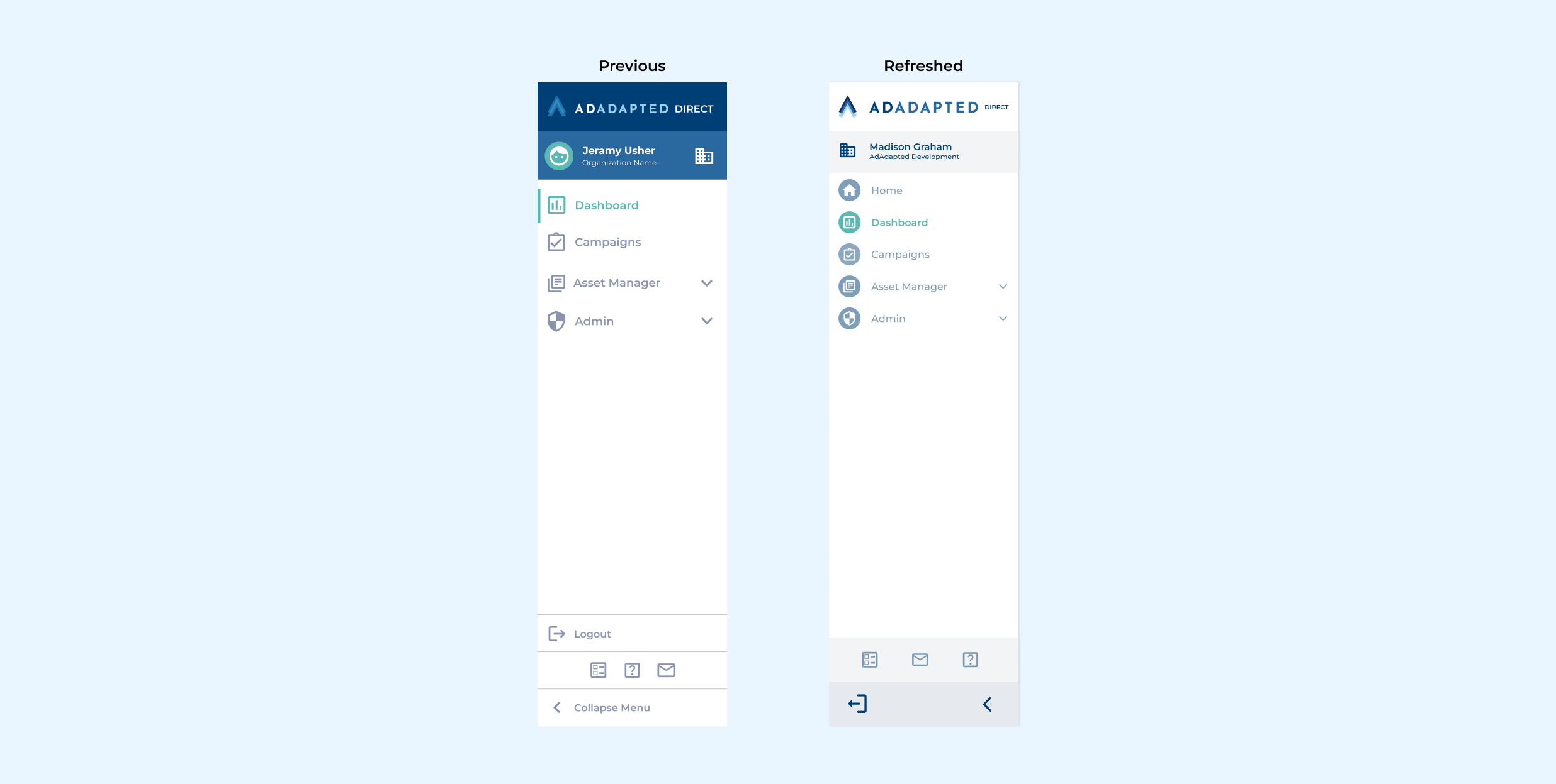
SIDEBAR REFRESH
Header: I adjusted the colors of the sidebar header to seamlessly blend with the white headers of other pages on the site, as the dark blues were attracting unnecessary attention from users.
Navigation: I enhanced the page navigation icons by adding an ellipse behind each one. This improves contrast across all icons and makes the selected page more distinct.
Footer: The icons in the middle section were spaced out to occupy a wider portion of the sidebar, creating a more centered appearance. I removed the logout and collapse menu text, although it remains visible on hover through tooltips, similar to the three icons above. This decision was based on the logout icon's universal recognition by users, with hover text providing any necessary additional feedback.
campaign forecast panel
Previous: The Campaign Forecast cluttered the create campaign form, requiring users to scroll back to the top to see their forecast, which is based on their budget, schedule, and run dates.
Updated: To save space within the create campaign form and prevent users from excessive scrolling, I moved the Campaign Forecast information to a separate panel on the side of the drawer that can expand or collapse as needed.
HOME PAGE
The home page was created to provide users with a high-level overview of all their campaigns, unlike the existing dashboard which only displayed individual campaign performance.
On the home page, users can view easy-to-read charts showing their campaign count by type and status, as well as their total impressions, clicks, and more. Additionally, pricing information is included for users to quickly check their campaign spending.


